Visualizations
Differential Flame Graph
The primary visualization for performance testing is a differential flame graph. This is based on Brendan Gregg's Flame Graphs with a few additions for averaging across runs, understanding differences between the two apps, and identifying mobile specific performance issues.

Average Flame Graph
The differential flame graph is split into head and base and each of these is an average of every run of the respective app. This is what makes the differential flame graph distinct from a flame graph or flame chart. A flame chart orders each frame chronologically, and a flame graph orders them alphabetically, merging frames next to each other with the same name. Since the average flame graph is a combination of multiple traces, the frames can not be in true chronological order, they may have originated from distinct runs at different times. Instead, frames of the same name are merged, but the original chronological ordering is preserved as much as possible. In practice for mobile apps this gives results similar to a flame chart while showing you the average across multiple perf tests.
For example:
The three stack traces: A -> C; A -> B; A -> C. Will be shown as a single A node with one C child appearing before a half as wide B child.
Head vs Base
A drop-down at the top of the differential flame graph allows you to switch between the head and base views. A perf test is always done comparing one head build to a base build, and the flame graphs for each of these are separated so you can identify what changed. For example, if you add a function in your PR the performance test results will not show that function when you look at the base build, but will when you look at the head build. You can switch between head and base to identify exactly what chain of calls were added or removed.
Differential Coloring

The flame graph colors are determined by the change in duration from head to base. Each frame is compared to the frame at the same position in the other build, the change is calculated as the difference between each frame, divided by the total duration of the base build. This change is scaled linearly between read and green colors. The darker red a frame is the more it contributes to an increase in time, the darker green the more it decreases time. Any frames with the same color represent equal contributions to change in time from base to head.
Base vs Head ColorsColors are the same between base and head views for the same frame. New frames in the head build will be red (how red depends on the duration of the new frame) and frames that only appear in the base build (meaning the change removed this function call) will appear green.
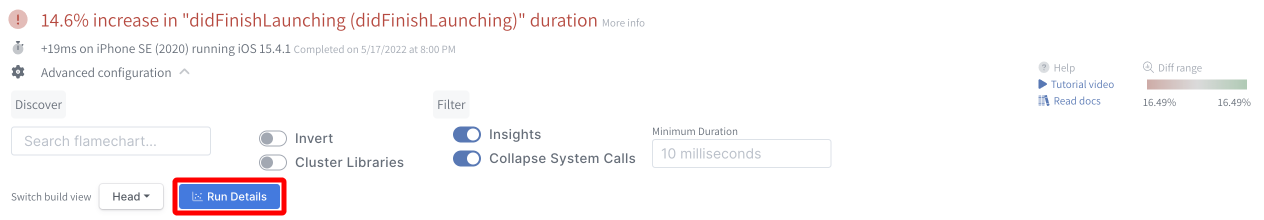
Run Details
In advanced configuration, there is a button to view all the runs the make up the average flame graph.
Emerge runs a test until there are enough samples to provide a statistically significant conclusion. Run Details brings up a graph that shows the detailed runtime for every iteration ran of the head and base build, allowing you to see the variance inherit in a specific test.
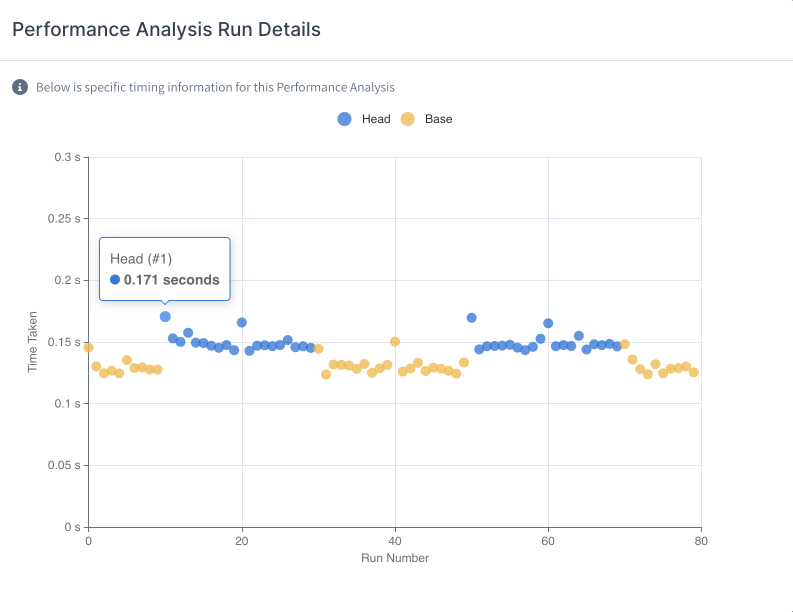
Individual Run Comparison
It can be valuable to compare outlier runs with "average" runs in order to determine if the variance is caused by flaky code. In the "Run Details" graph, you can click on any two runs to compare them against each other.
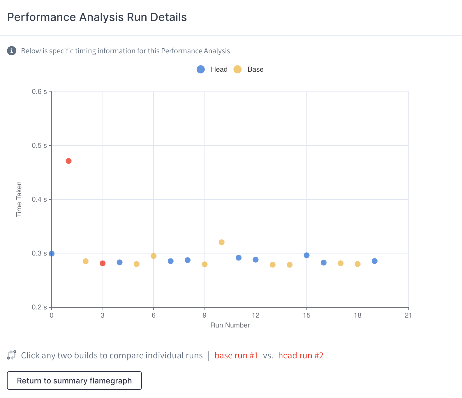
From there, you'll be able to access all the features of Emerge's flame graph in order to better diagnose your app's performance.

Inverted
Inverted mode helps you see the total time spent in functions at the end of stack traces. This mode flips every stack trace and then orders each level alphabetically before merging.
This can be tricky to understand intuitively, so an example works best. Say you have an iOS app that does a lot of string comparisons with [NSString containsString], or an Android app that does similar with String.contains. These might be hard to find in the default view because they will be towards the bottom in multiple places of the graph, and each one will be small. In the inverted view all these calls at the bottom will be moved to the top, and the individual calls will merge so you can see in total how much time was spent in this function. The children of this frame will let you dig into the callers of this function.
TipUse the inverted view to identify functions that are called repeatedly and really add up. Often you can memoize these or remove them entirely.
Note for Swift apps
In Swift apps a common result of viewing the inverted trace is to see Swift runtime functions taking a lot of time, particularly if you use dynamic features of the runtime like reflection or as casting. Sometimes this is unavoidable, but we have a blog post explaining why this adds up to so much time and some things you can do about it.
Collapse System Calls
To simplify the view, you can enable this setting that collapses consecutive system calls so that only the first is shown. This lets you focus on just the performance of your code, and the system calls that it directly calls into, and not the internals of system code.

Updated 5 months ago